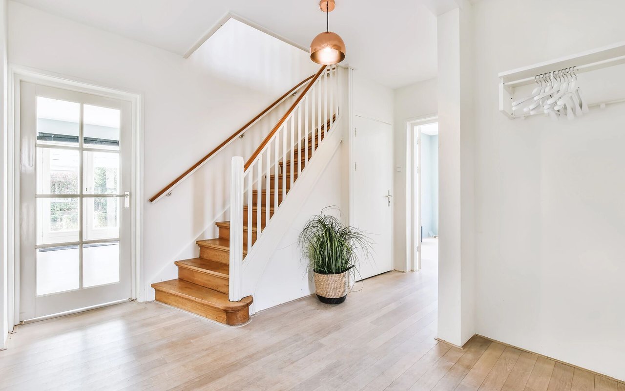
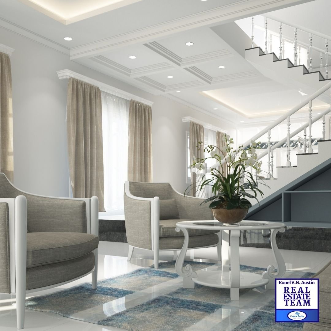
The all white look has been trending for a while now, and while interior designers keep promising that color will invade the next season, homeowners are hesitant to take the plunge. However, over half of those surveyed said they are tired of the vanilla look, saying it feels bland and boring.
Why aren't moving into color? "It just feels like too much of a commitment," says interior designer Gretta Surshaw. "Selecting a white sofa, a white end table, white drapes, white shelves, white clocks - it's practically fool proof. You layer shades of white, cream, beige, tan, layer undertones and intensity and it more-or-less works out. To the untrained eye, anyway."
She further explained selecting color takes a lot more skill, making it overwhelming for many homeowners, as they fear they will make the wrong choice and be stuck with a piece they hate or a need to repaint the wall yet again.

Make it work
If you are certain that the all white look is the one for you, try these tips and tricks to keep the look from feeling BLAH.

-
Pay attention to the undertones. Yellow undertones are warmer, giving a cream like look. Blue undertones look cool and crisp. Use the warmer yellow undertones if you don't have a lot of windows or natural light. It will look great with LED or fluorescent lighting, which tends to be cooler. Use the blue undertones if you have a lot of windows with warm natural light.
-
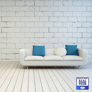
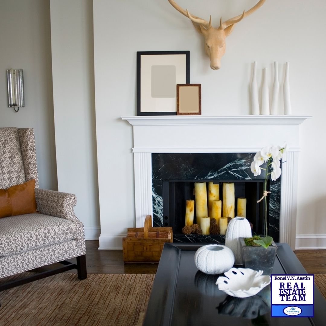
Use colors on the opposite side of the color wheel as accents to add a pop of color. For example, add a blue book and an orange vase into your all white book shelf, use the colors again in your throw pillows.
-
Layer textures. A white chenille throw, a tan jute rug, a creamy chunky knit throw pillow. Textures are important if you don't want a one-dimensional look. They add warmth, style, and a professional flair.
-
Don't match everything, unless you're going for a super modern look. Don't make it all icy white, or creamy white. And no matter what you see on HGTV, resist the urge to make everything "shabby chic" or "weathered" or "vintage." You will get the most bang for your buck when you are careful to apply those finishes to just a few select pieces.
-
Greenery is your friend. Do not use sparingly. Indoor plants, real or faux, make for a wonderful color accent to break up any white space. Go wild with varieties of palm fronts or get a country feel with potted herbs. Don't do both. Pretend like you are planting all these plants together. If they wouldn't be found in the state or season, they don't go together inside either. Of course, some greenery is unidentifiable but beautiful. If that's the case, just make sure the greens go well together.